I’m not a graphic designer, but (with apologies to the excellent Joan Armatrading) I’m open to persuasion. Here are a few layout techniques I’ve absorbed by hanging out with these masters of pixel-shuffling.
Effective layout satisfies three distinct design goals:
- explanation;
- efficiency;
- trust.
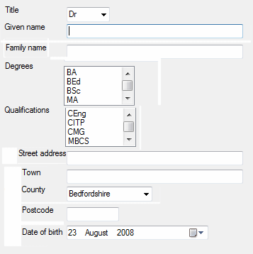
Here’s a screen that doesn’t quite work. Could you use it? Sure. Would it offer a satisfying user experience? Probably not.
Explanation
Chunking
New users need to “parse” an unfamiliar screen in order to identify the major elements and then construct a plan, a set of tasks and subtasks that satisfy their goals.
Bad layout presents an undifferentiated body of fields. It is perceived as a noisy tangle of detail. Good layout is a teacher. It uses grouping and separation to “chunk” content in a way that communicates the high level task-model.
Desktop applications typically use Group Boxes to outline related fields. Web style applications use a variety of graphic design techniques such as boxes, rules, tints and whitespace. Although the aesthetics vary, all these techniques draw on the same idea, Gestalt principles of form perception..
You can also visually sequence groups and controls to suggest the natural order in which they should be used. Here’s an example from a self-service form to apply for benefits. In this case, it makes sense to find out whether the specific benefit is useful to you before you take action. You might also want to check that you qualify before investing time in filling a complex form.
1. Assess relevance of benefit
2. Check entitlement to benefit
3. Apply for benefit
Conventional sequences can also be helpful. Although you might order your entire meal at once from the online deli, you probably still think about that meal as a sequence of courses.
1. Choose starter
Starter menu
2. Choose main course
Main dish menu
Vegetable menu
Side order menu
3. Choose dessert
Dessert menu
Cheese board menu
Mapping
You can use “mappings” to explain the relationships between screen elements. For example, if you need to display four buttons to move up, down, left and right, consider placing them at four points of an imaginary compass. Although you do lose some real estate, you can simplify the experience by exploiting your users’ knowledge and motor skills.
Look for opportunities to exploit relationships to objects in the real world or to conventional representations of information. Up implies more; left implies previous, cause (of some effect to the right) and, umm, left. Table cells imply the interaction of the two concepts in the row and column headings. Watch out for tricky cultural differences! For a neat example of mappings, take a look at the navigation controls on Google maps.
For more on mappings, take a look at The design of everyday things by Don Norman
Purposeful typography
Typography can also exploit Gestalt principles. Items presented in the same colour or typeface are seen as related. For example, if you show an example of the required data format adjacent to each data entry field, use a consistent and distinctive typographical style to help the user pick out these helpful hints. Consider using the same typeface for inline instructions (“Select a set of features to customize your car”) to visually connect all the “help” resources and to differentiate them from other elements such as group and field labels.
Visual hierarchy
Good design draws the user’s attention to important elements on the screen. Just as a hierarchy of alerts in an industrial control room distinguishes safety-critical incidents from routine events, you can use colour, type size and symbols to design a visual hierarchy that draws the users attention to errors and exceptions and important instructions.
Efficiency
Less work for the hands
According to Fitts’s law, you can reduce the cost of “pointing” by tight placement of controls that are frequently used together. Making the controls larger also helps. Paradoxically, you can pin controls right at the edges and corners of the screen. This makes them an easy target with no risk of overshooting.
Less work for the eye
Scanning complex information is hard work. Effective use of headings, tables, columns and lists can guide the eye, making it easier to find what you need and to understand the relationships between different elements.
Trust
Scruffy layout suggests carelessness and poor craftsmanship. Here are a few basics that some developers overlook.
- Align fields neatly.Whether you align to the left or right, ensure that at least one margin is neatly lined up. If you have multiple columns, try to align both vertically and horizontally. Graphic designers often start by defining a grid and then positioning blocks and elements on the cells of that grid. Layout managers, visual screen designers, and PhotoShop guides and grids can all help here. Visual Studio Express has some nice tools to make this easy.
- Space fields evenly.Define rules and stick to them. Again, this applies both vertically and horizontally. You might, of course, want to make an exception if you’re using layout for mappings.
- Space headings asymmetrically.Typically, headings need more space above than below. This creates whitespace to help with visual chunking. Many programming languages such as CSS, Java and C# allow you to specify margins for GUI elements.
- Give it room to breathe.Don’t cram fields too closely together. Watch out for text-wrapping, overlapping or clipping of labels due to insufficient space.
- Less is more.Use colour, typefaces and graphics with consistency and restraint. As with spacing, define a typographic scheme and follow it consistently. Here’s a counter-intuitive guideline; if you use two different typefaces, use two different typefaces. For example, print designers often contrast a serifed font for text with a non-serifed font for headings. If you are working in HTML, consider creating named CSS classes to represent different styles of label. In object-oriented languages, it can be helpful to subclass standard GUI label classes to create standard reusable components for common elements such as field and group labels.For more on the charms of type, see Stop stealing sheep by Spiekermann and Ginger.
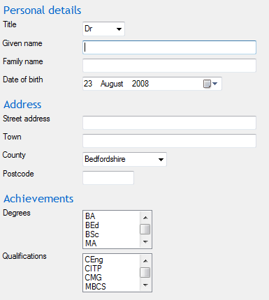
Here’s a rework of the monster above. It’s tidy and pleasant enough to look. Most importantly, you can clearly see the task model with subtasks sequenced in a conventional order
So, to design a screen that delivers explanation, efficiency and trust, consider grouping, sequencing, mapping, positioning, and typographic hygeine.
Alternatively, just make friends with a graphic designer.
 User experience architecture