User experience architecture

August 26, 2009

Designing services

Designing services

Four customers in search of a service

Joan wants to contact her local government to report a dead deer on the main road. Paul needs to tell his bank about a stolen credit card. George needs to deal with workplace bullying by a co-worker. Rinka wants advice about the criteria for adopting a child.  In spite of their very individual situations, they each need to find and consume a service.

Services defined

Services cover a lot of ground:  paying bills; managing your money; finding a job; accessing government; bidding on a contract; finding real-estate; fixing technical problems … and so on. But not every transaction is a service. Here are some characteristic features.

  1. A service has a consumer and a supplier. Their collaboration creates mutual value.
  2. The consumer and supplier have different affiliations.  For example, the consumer might represent a household and the supplier might represent an electricity provider.
  3. The provider offers a  resource (or access to a resource)  of value to the consumer.   For example, resources might include problem resolution, work, permissions, statutory reporting, data, knowledge or infomation about finding and using some facility. Buying a book is not a service in this sense; getting a library ticket is.
  4. The consumer’s access to a service may be restricted by individual status and availability. For example, an applicant for a busker’s license must show musical ability. On the other hand, anyone can report a pot hole.
  5. A service may be free or charged.
  6. Services may be delivered over multiple channels. The online channel is typically the most cost effective.

The anatomy of a service

There’s a pattern to services.  They generally have several of the following  elements.

One group provides information to enable a consumer to find and assess the service.

  1. Applicability criteria: who can use this service?
  2. A process: who does what?; what happens next?
  3. A service level agreement; what does the supplier commit to; what must the consumer agree to?
  4. Key facts: when, where, how long, how much, how often?
  5. Authorities: references to regulation, legislation and policy.
  6. Contacts: who can provide further information?

The second group, carries the “payload” of the service.

  1. Knowledge.  Examples include the commercial interests of politicians, techniques for surving a hurricane and an index of dog-friendly beaches.
  2. Specific data. Examples include a personal bank balance, neighourhood refuse collection timetables and local weather forecasts.
  3. Transactions that initiate requests.  Examples include application  forms and e-mail links.

Designing services

From the perspective of Joan, Paul, George and Rinka, each of these services is a  task to satisfy a goal associated with a role. At a superficial level, the scenario is parallel to buying a product. For example, the task model involves finding, comparing, assessing, selecting and, in many cases, paying and arranging fulfilment.

As practitioners, we have powerful tools to tackle this class of design problem. For example, focus groups, task analysis, design patterns and user testing can all help to ensure that an efficient and intuitive interaction delivers appropriate outcomes. However, services offer some additional and distinctive usability challenges:

  1. Services are typically not “known item” searches. Joan probably does not know that the local Council labels this service a “highway wildlife casualty”.
  2. Services are often needed in stressful situations. Paul needs to get his card cancelled immediately – and he needs to be confident it’s been done.
  3. It’s not necessarily obvious who provides a service. Georgina may not be sure who can offer authoritative advice in this sensitive situation.
  4. Services can be intimidating and complex. Rinka may struggle to understand the densely worded prose of child welfare experts.

Let’s look at this from other side of the glass – from the point of view of the highways department, the bank, the HR team and the welfare workers.  Self-service is a potent business model. Increased adoption reduces contact-centre costs and, potentially, improves customer satisfaction through increased convenience and autonomy.

Self-service also looks easy to implement: delegate the work to the owning departments; have experts document their expertise as web content; translate the paper forms to HTML; generate e-mails; serve up the package through search; and reuse an existing taxonomy to define a navigation scheme.

Getting services right

Experienced designers will have already spotted the gotchas. Delegating design can create inconsistencies, encourage “territorial” design patterns and bypass the efforts of design professionals.

Here’s a list of known risk factors:

  1. Services are hard to find. An “inside-out taxonomy” defines an enigmatic browse structure, intuitive to the service provider but opaque to consumers. Search is hindered by cryptic and inconsistent naming. Neither content or metadata have been been tuned for search engine optimisation.
  2. No support for near misses. There is no “related services” model or helpful grouping of results  to identify similar or alternative services. Services names and descriptions are not structured in a conistent format to facilitate comparison.
  3. Services are grouped by supplier organisation. Consumers expect services to be organised by user role and goal rather than by owner.
  4. Noisy information. Descriptions are long, wordy and padded with irrelevant content such as departmental history, mission and achivements. Customers prefer concise service descriptions focused on critical elements:  how much does it cost?; when is it open?; how long will it take?
  5. Challenging information. Descriptions use jargon, technobabble or overly formal language. Plain English not only ensures understanding but also builds confidence, trust and brand advocacy.
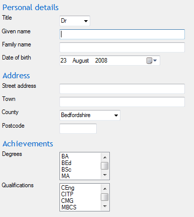
  6. Rambling information.  Effective content is consistently structured, using generous subheadings to signpost specific sections. Task-based writing, bullet-points and tables can all add structure.
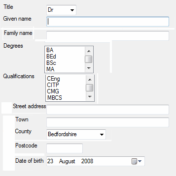
  7. Obscure forms.  Ambiguous questions, jargon, poor field grouping, insufficient field completion support, bad layout and obscure error messages all make form-filling unnecessarily hard.
  8. Greedy forms.  Nosey and just-in-case questions add effort and discourage completion.
  9. Separation of elements. When information and forms are not integrated, two things can happen: either users make guesses about the applicability and process – or users take no action.

Getting it right for our fab four  is perfectly practical.  However, in addition to  effective UCD,  it also takes standards, processes, training and an architectural  focus on design in the large.

July 3, 2009

User testing – a foundation recipe

User testing – the foundation recipe

Improvisation from basics

Every good cook has some treasured foundation recipes: a simple muffin mix to which she can add nuts, chocolate or spices; perhaps a tomato and onion based soup to which she can throw in seasonal vegetables, pasta or chopped ham; maybe a spicey curry base that works well with prawns, chicken or vegetables.

To improvise in the kitchen, firstly master the basics then understand when each variation is appropriate. For a white sauce, add parsley to accompany fish. Add mustard for boiled bacon or cheese for savory pancakes. No onions? Chop a scallion. Left over Tarragon? Chop it up; chuck it in. Last night’s Salsa? Think again!

Experienced usability practitioners follow a similar approach in designing a usability test. It’s applied science; observation and analysis are fundamental. However, depending on goals and constraints, we can look for many things, observe in different ways and choose from a wide range of analytical techniques. As with cooking, there’s a foundation recipe and a wide range of variations.

User testing – the foundation recipe

Here’s a seven-step recipe that covers most types of testing. The two activities in parenthes are not strictly part of the method; they do, however, reduce risk and ensure that you learn from your experience.

1.
Design
study
2.
Recruit
participants
3.
Prepare artefacts
(Pilot) 4.
Observe
Measure
Ask
5.
Analyse data
6.
Report results
7.
Brief client
(Project debrief)

You can expect to have some activity for each step. However, the nature and scope of that activity will vary according to the needs of the client and the culture of the project. Consider a test to assess the safety of a remotely-controlled radiography device. You might plan for hypothesis-testing (design study) using a large sample size (recruit participants) to record error rates (measure) for statistical analysis (analyse data).

The report (report results) might become a formal project deliverable while a handover meeting (brief client) would be essential for a mixed audience of technical, business and medical specialists. It’s the equivalent of high-tea, muffins with chopped dates, walnuts and cinnamon.

For a small-scale “in-flight” study, the model is the same but the activities are smaller and simpler. A formative research design (design study) uses a small sample (recruit participants) to acquire data (observe, ask) for qualitative analysis (analyse data). The results are presented in a PowerPoint deck (report results) and reviewed by the design team and project manager (brief client). This situation is more like a simple dusting of caster sugar – good rather than fancy.

Variations

Here are the nuts, raisins and chocolate chips to add to the basic recipe.

1. Design study Summative, Formative, Benchmark, Competitive, Comparative

User-driven, “chauffeured”
Open-ended, Scripted?

2. Recruit participants Quota sample, Stratified sample, Opportunity sample

Recruit directly, Use an agency

Volunteers, Incentives

3. Prepare artefacts Paper, Static, PowerPoint, Axure etc, Wizard of Oz, Live code
4. Observe Direct, Indirect (video), Remote (e.g.TechSmith)

From a control room, Side-by-side

In a lab, In an office, In the field

4. Measure Count, Time, Code, Checklist
4. Question Active, Passive
Interrupt protocol, Debrief protocol, Before-and-after protocol
5. Analyse data Quantitative, Qualitative

Specific observations, Generalised issues

Descriptive, Analytical

Business impact oriented, Solution feature oriented

6. Report results Document, PowerPoint, Annotated video, Verbal

Formal, Informal, Standardised

7. Brief client Briefing, Review, Action-planning

You can read more about these techniques in books such as Practical Guide to Usability Testing (Dumas) or Human Computer Interaction (Preece et al).

Checklist

The success of a user-test is pretty much determined by the quality of the thinking you do before you book a lab or approach a recruiter. Here’s a checklist that covers the main issues. Use it as the basis of a workshop or planning session before you start on design and logistics.

1. Design study
  • What do want to find out?
    • Summative – is it good enough?
    • Formative – how could it be improved?
    • Benchmark – how good is it now?
    • Competitive – how does it compare to competitors?
    • Comparative – which alternative works best?
  • Who is your target audience?
  • What tasks do you want to test?
  • Who will “drive” – you or your participants?
  • Is it open-ended or does it need to follow a pre-defined path through the prototype?
2. Recruit participants
  • How are you going to find the people you need?
  • What incentives will you offer them?
  • How you are you going to get them in the right place at the right time?
  • How long do you need them for?
3. Prepare artefacts
  • In what form will you show the design to the participants?
  • How interactive does it need to be?
  • How much ground does it need to cover?
  • How high fidelity should it be?
4. Observe
  • What events and outcomes are you looking for?
  • How will you record them?
  • How many observers will you use?
  • How visible should you be?
  • How involved should you be?
  • What balance are you seeking between recording expected events and noticing surprises?
  • How will you ensure that observation does not distort the data?
  • What evidence will you need?
4. Measure
  • What events and outcomes do you want to measure?
  • How will you log the data you need?
  • How will you ensure that the measurement process does not distort the data?
4. Ask
  • What attitudes and insights do you need to capture?
  • When will you capture this information? During a task, after each task? At the end of the study?
  • How will you ask the question? In person, on a form, through the design itself?
  • How will you calibrate this information? Do you need to capture an opinion before each task?
  • How will you record this information?
  • How will you ensure that asking questions does not distort observations and measurements?
5. Analyse data
  • What is the right blend of qualitative, quantitaive and video?
  • What’s the analytical focus: the problems; the causes; the impact; or recommendations?
  • What level of rigor is appropriate and affordable?
6. Report results
  • Who is going to read it? What do they need to know?
  • How long and formal does it need to be?
7. Brief client
  • How do we turn the study into a pragmatic, actionable plan?
  • How do we get commitment to change?

As in the kitchen, get the basics right but be prepared to improvise the detail. That way you’re still ready when you don’t have the right method in the store cupboard.

September 18, 2008

Five heuristics for designing classification


Whether you’re designing a home page, a store layout or a document library, you’re practicing information architecture to define a classification scheme. At the heart of this scheme is a set of classes. These act as “shelves” on which you group sets of “books” that have something in common.

For example, the classes “Red, white and rosé” classify wines by colour. “Acoustic, solid electric, semi-acoustic and electro-acoustic” categorize guitars by body style. “Starters, entrées and desserts” classify recipes by course. The wine lover knows to look in “White” for Chablis and Frascati. A guitarist confidently goes to “solid electric” to find a Stratocaster. A chef will expect to find a Pavlova under “desserts”.

An effective scheme reliably lumps similar items together and splits different items apart. Here are 5 heuristics that should help. In each example, misfit classes are highlighted.

Homogenous The classes describe similar types of things at the same level. Labels use consistent formats and labels. apples, pears, bananas, sprouts , peaches, Cox’s Pippins, apricots, actinidia deliciosa


Sprouts are out of place in the fruit bowl. Pippins are a type of apple, not a type of fruit. Actinidia deliciosa is Kiwi fruit. Although the class fits well, the latin label is inconsistent.

Mutually exclusive The classes do not overlap. Any item clearly fits in one – and only one – class. saloons, hatchbacks, coupés, family, estates, sports, 4X4s, vehicles


The two lifestyle classes, “family” and “sports”, overlap with the body style classes. “Vehicles” is a superclass of all other classes – and overlaps everything.

Collectively exhaustive As a set, classes cover all items. French, German, Spanish, Californian, Chilean


Where’s the Valpolicella?

Understandable Classes have labels that make sense to the reader. rhinovirus, tussis, cephalalgia


Coughs, colds and headaches – if you happen to be a doctor or a classicist.

Useful The classes group items in a way that supports the reader’s needs. Red books, blue books, green books, yellow books, grey books, black books, white books

Perfect if you want to coordinate your library with the soft furnishings. Otherwise, consistent, logical and useless.

For more on library science, I recommend Classification made simple” by Eric Hunter.

August 31, 2008

Usability and the happy shopper

It’s a cliché of our discipline; a usable e-commerce site generates more sales. Web analytics show measurable differences in consumer behaviour following design changes. The idea is now sufficiently established that “good experience” is widely seen not so much as a market differentiator but as a hygiene factor, a fundamental tool to deliver a sales and marketing strategy.

Let’s tease this idea apart to identify why good design drives sales and how we can exploit the usability toolkit to get it right. We need to look at how people shop, the limits on economic rationality and the web as a social medium.

How shopping works

A simple task model

  1. Discover a product
    1. Become aware of a product
    2. Find information about the product
    3. Assess personal relevance of the product
  2. Select model
    1. Identify alternative models of the product
    2. Identify alternative suppliers of the product
    3. Assess and compare
    4. Select a model
  3. Select a channel
    1. Identify alternative channels for product
    2. Assess and compare
    3. Select a channel
  4. Buy
    1. Find the product
    2. Manage basket
    3. Specify delivery
    4. Pay

This model includes cognitive, social and practical steps; each step represents a risk of failure. Customers can only buy products they have heard about. They need to understand what a product does and how it could enhance their lives. They look for an outlet that is trustworthy, affordable and convenient.

What shoppers need

Within this task model, there are some important user goals:

  • finding;
  • discovering;
  • understanding;
  • assessing;
  • comparing;
  • choosing; and
  • administering.

Finding means locating information that you know is there. You find a number in the phone book. Discovery is more subtle. It reveals information that you need – but don’t know that you need. For example, you might discover an attractive new variety of hybrid Rose while browsing your garden centre for a watering can. Finding and discovery are goals of Information Architecture. The more complex the product set, the greater the need to focus on “findability”.

Understanding, assessing, comparing and choosing work together. They enable a customer to make a decision about trying something new. Adoption is an intellectual process, a social process and an emotional process. According to Everett Rogers’ influential Diffusion of innovation, potential customers seek information to reduce uncertainty and assess “relative advantage”. Well written content quickly answers the tough question, “What’s in it for me?” Consistent coverage and layout make it easy to compare alternatives. Clear and influential content is the goal of copywriting and information design.

Administering is a chore; where should it be delivered? how do you want to pay? Good software ergonomics ensure that this data entry is efficient and simple. This is good old-fashioned usability at work.

Bounded rationality

Economists generally assume that buyers act rationally, seeking to minimize their costs and maximize their returns. Shoppers seek information and compare alternatives in order to make sound economic decisions. Herbert Simon refined this model: “maximisers” keep researching till they find the perfect product; “satisficers”, on the other hand, stop when they find a product that is good enough. In either case, well-written and trustworthy information is essential to discourage defection to another site.

Trust

Shopping is a social act. A well-crafted design suggests a professionally-run business. Direct, personal language implies plain dealing. Editorial content can demonstrate interest and expertise. User-generated content adds credibility and social “buzz”. Plain English says, “we don’t need to hide behind the small print.” Explicit privacy and security policies tackle distrust of online payment. Attractive presentation and engaging writing create a sense of well-being that can transfer to a positive view of the products on display.

Designing for a good shopping experience

An effective design actively addresses the needs of shoppers. Here are some examples.

Discovering The catalog reflects the way customers understand and use products. It avoids the “house” taxonomies of manufacturing and marketing. It uses carefully managed see-also links to identify genuine alternatives.
Finding
Understanding Product descriptions are clear, complete, consistent and easy to read. Technical terms are explained. Potential uncertainties are recognised and addressed.
Assessing Product descriptions explain relevant benefits in a direct, concise style. They avoid marketing clichés and adopt a direct, personal style, consistent with the values of potential buyers.
Administration Payment and delivery dialogs exploit sensible defaults, remember preferences and tightly integrate payment engines to eliminate repeated data entry.

A good shopping experience


“I came across Kopi coffee on the coffeemajic site. It’s the world’s most expensive coffee, made from beans ‘predigested’ by a civet. Because it sounded fascinating and vile in equal measure, I sought out buyer reviews on the company’s community board and read about the personal experiences of the chief taster. That was enough background for me; I convinced myself I had to try it.
I used the product list to compare the price and flavour of different brands and quickly settled on one variety to check out.

I thought about picking up a packet at my local deli. However, because the site remembers my details, it was just faster to buy it there and then.”

August 23, 2008

Designing screen layout for explanation, efficiency and trust

I’m not a graphic designer, but (with apologies to the excellent Joan Armatrading) I’m open to persuasion. Here are a few layout techniques I’ve absorbed by hanging out with these masters of pixel-shuffling.

Effective layout satisfies three distinct design goals:

  1. explanation;
  2. efficiency;
  3. trust.

Here’s a screen that doesn’t quite work. Could you use it? Sure. Would it offer a satisfying user experience? Probably not.

Untidy screen layout with inconsistent alignment, inappropriate field groupings and incorrect sequence of elements

Explanation

Chunking

New users need to “parse” an unfamiliar screen in order to identify the major elements and then construct a plan, a set of tasks and subtasks that satisfy their goals.

Bad layout presents an undifferentiated body of fields. It is perceived as a noisy tangle of detail. Good layout is a teacher. It uses grouping and separation to “chunk” content in a way that communicates the high level task-model.

Desktop applications typically use Group Boxes to outline related fields. Web style applications use a variety of graphic design techniques such as boxes, rules, tints and whitespace. Although the aesthetics vary, all these techniques draw on the same idea, Gestalt principles of form perception..

You can also visually sequence groups and controls to suggest the natural order in which they should be used. Here’s an example from a self-service form to apply for benefits. In this case, it makes sense to find out whether the specific benefit is useful to you before you take action. You might also want to check that you qualify before investing time in filling a complex form.

1. Assess relevance of benefit

2. Check entitlement to benefit

3. Apply for benefit

Conventional sequences can also be helpful. Although you might order your entire meal at once from the online deli, you probably still think about that meal as a sequence of courses.

1. Choose starter

Starter menu

2. Choose main course

Main dish menu
Vegetable menu
Side order menu

3. Choose dessert

Dessert menu
Cheese board menu

Mapping

You can use “mappings” to explain the relationships between screen elements. For example, if you need to display four buttons to move up, down, left and right, consider placing them at four points of an imaginary compass. Although you do lose some real estate, you can simplify the experience by exploiting your users’ knowledge and motor skills.

Look for opportunities to exploit relationships to objects in the real world or to conventional representations of information. Up implies more; left implies previous, cause (of some effect to the right) and, umm, left. Table cells imply the interaction of the two concepts in the row and column headings. Watch out for tricky cultural differences! For a neat example of mappings, take a look at the navigation controls on Google maps.

For more on mappings, take a look at The design of everyday things by Don Norman

Purposeful typography

Typography can also exploit Gestalt principles. Items presented in the same colour or typeface are seen as related. For example, if you show an example of the required data format adjacent to each data entry field, use a consistent and distinctive typographical style to help the user pick out these helpful hints. Consider using the same typeface for inline instructions (“Select a set of features to customize your car”) to visually connect all the “help” resources and to differentiate them from other elements such as group and field labels.

Visual hierarchy

Good design draws the user’s attention to important elements on the screen. Just as a hierarchy of alerts in an industrial control room distinguishes safety-critical incidents from routine events, you can use colour, type size and symbols to design a visual hierarchy that draws the users attention to errors and exceptions and important instructions.

Efficiency

Less work for the hands

According to Fitts’s law, you can reduce the cost of “pointing” by tight placement of controls that are frequently used together. Making the controls larger also helps. Paradoxically, you can pin controls right at the edges and corners of the screen. This makes them an easy target with no risk of overshooting.

Less work for the eye

Scanning complex information is hard work. Effective use of headings, tables, columns and lists can guide the eye, making it easier to find what you need and to understand the relationships between different elements.

Trust

Scruffy layout suggests carelessness and poor craftsmanship. Here are a few basics that some developers overlook.

  1. Align fields neatly.Whether you align to the left or right, ensure that at least one margin is neatly lined up. If you have multiple columns, try to align both vertically and horizontally. Graphic designers often start by defining a grid and then positioning blocks and elements on the cells of that grid. Layout managers, visual screen designers, and PhotoShop guides and grids can all help here. Visual Studio Express has some nice tools to make this easy.
  2. Space fields evenly.Define rules and stick to them. Again, this applies both vertically and horizontally. You might, of course, want to make an exception if you’re using layout for mappings.
  3. Space headings asymmetrically.Typically, headings need more space above than below. This creates whitespace to help with visual chunking. Many programming languages such as CSS, Java and C# allow you to specify margins for GUI elements.
  4. Give it room to breathe.Don’t cram fields too closely together. Watch out for text-wrapping, overlapping or clipping of labels due to insufficient space.
  5. Less is more.Use colour, typefaces and graphics with consistency and restraint. As with spacing, define a typographic scheme and follow it consistently. Here’s a counter-intuitive guideline; if you use two different typefaces, use two different typefaces. For example, print designers often contrast a serifed font for text with a non-serifed font for headings. If you are working in HTML, consider creating named CSS classes to represent different styles of label. In object-oriented languages, it can be helpful to subclass standard GUI label classes to create standard reusable components for common elements such as field and group labels.For more on the charms of type, see Stop stealing sheep by Spiekermann and Ginger.

Here’s a rework of the monster above. It’s tidy and pleasant enough to look. Most importantly, you can clearly see the task model with subtasks sequenced in a conventional order

Tidy screen layout that addresses the issues in the previous image

So, to design a screen that delivers explanation, efficiency and trust, consider grouping, sequencing, mapping, positioning, and typographic hygeine.

Alternatively, just make friends with a graphic designer.

August 16, 2008

Designing screen layout with Visual Studio Express

It’s an old debate. what’s the best tool for prototyping screen designs?

For early abstract design, I like the minimalism of a spreadsheet set to a regular grid. For smoke-and-mirrors interaction, I’ve had good results with Axure. It also does a nice job on managing design process metadata: issues; alternatives; and open questions. For day-to-day sketches, PowerPoint is competent and is ideal for sharing ideas with colleagues in other disciplines.

For more precise screen layout, I’ve been impressed by the forms designer in Microsoft Visual Studio Express for C#. Here are some specific features I’ve found helpful:

  • Field alignment

    As you drag a field across the screen, the designer draws a blue line to visually indicate any field with which it is is aligned. “Aligned” means that an edge (top, bottom, left, right) in one field matches an edge in another. A magenta line also shows when the text baselines are lined up. This is handy for neatly laying out forms, nested containers and any complex design where you don’t have a regular grid to guide your eye.

    Aligning three buttons

  • Margin management

    You can set margins properties on a control such as a button or text field. As you drag this control, the forms designer draws a connecting line to nearby objects whenever the control is positioned at exactly the margin distance away. For example, you might set up section headings to have a larger margin above than below. Using this technique to drag a set of fields below each heading would ensures consistent grouping and separation in line with Gestalt principles.

    Using margins to position labels and buttons

  • Layout managers

    You can add flow layout panels and table layout panels and then drop controls onto those panels. For simple layouts, this saves a lot of time. The table layout is handy for simple forms in which each row contains a label, a field and some guidance. The flow layout is convenient for facet style menus or tag clouds.

    Using a flow layout panel to present a faceted menu

Together, these features take the tedium out of defining a neat and consistent layout. The experience is unobtrusive but quietly rewarding.

August 9, 2008

Data good; findings better

Filed under: evaluation — Tags: , , , , , — uxarchitecture @ 11:06 am

I get to read a lot of usability studies. Some are insightful and persuasive, clearly communicating the main issues and inviting action. Others contain indigestible inventories of raw data. Here are some examples:

  • a long list of specific errors;
  • an exhaustive set of annotated screen shots; or
  • a table of design problems grouped by page.

A heuristic evaluation can generate hundreds of expert comments. Likewise, a skilled observer can capture many subtle observations by analysing the video from a usability study. Data is good – but data is exactly what it is, the raw material from which a skilled analyst extracts findings.

Here’s what clients tell me they want to know.

  1. How well does it work?
  2. What are the major problems?
  3. What’s the impact on my users and my business
  4. What do I need to do to fix it?
  5. How can my design team learn from this?
  6. How do I know you’ve done thorough and impartial work?

The missing step in these “briefcase buster” reports is analysis. A usability practitioner needs the ability to mine hundreds of data points to extract the one or two pages of insight that truly answer the client’s questions. There are many methods including; shuffle-the-post-it, qualitative analysis and mapping to guidelines. Here’s a route-map.

  1. Analyse data to create findings. A finding describes a pervasive issue: the graphic design is primitive; the actions do not match the user’s task model; terminology is arcane and inconsistent.
  2. Support findings with selected data. This demonstrates rigor, illustrates abstract ideas with concrete examples and adds emotional impact.
  3. Describe the specific impact on the business: higher learning costs; lower adoption; brand damage; reduced sales.
  4. Recommend design changes: follow the Windows style guide for radio button behaviour; do not use a fixed font size; describe business processes in plain English.
  5. Recommend tools and methods improvements: consider using a professional graphic designer; construct a task model before designing screens; read the Polar Bear book.

Good findings should be high level, clear, business-focused and actionable. Above all, to paraphrase the good Doctor, “Speak the client’s language” To us it’s a research project, to them it’s an investment.

Blog at WordPress.com.